Jim Vincent Andes Engay's Project Portfolio Page
Project: Archangel
Archangel is a desktop address book application used for managing patient data and appointment scheduling for medical professionals. The user interacts with it using a CLI, and it has a GUI created with JavaFX. It is written in Java, and has about 10 kLoC.
Given below are my contributions to the project.
- New Feature: Added the code foundation for filtering Appointment commands.
- What it does: Allows users to filter appointments with specific Appointment filters.
- Justification: This feature is necessary to provide the different queries on appointments. Multiple commands were implemented using this code foundation.
- Credits: Original CS2103T AddressBook implementation of
SearchNameFilterwas referenced for the implementation ofappointmentfilters.
- New Feature(s): Added daily and upcoming commands.
- What it does: Filter appointments to show daily and weekly appointments.
- Justification: These are core features needed to make this application appointment-centric.
- Highlights: This feature provided the backbone for the calendar feature and commands that involved filters which my teammates have implemented.
- Credits: Original CS2103T AddressBook implementation of
PatientFindCommandwas referenced for the implementation ofAppointmentTodayCommandandAppointmentWeekCommand.
- New Feature(s): Added commands that filters tags and patient in appointment.
- What it does: Filter appointments to appointments based on the keywords provided.
- Justification: These features enable better appointment organisation, which is one of the focus of Archangel. The ability to view your Appointments by tag or patient allows better user experience.
- Credits: Original CS2103T AddressBook implementation of
PatientFindCommandwas referenced for the implementation ofAppointmentTagCommandandAppointmentFindPatientCommand.
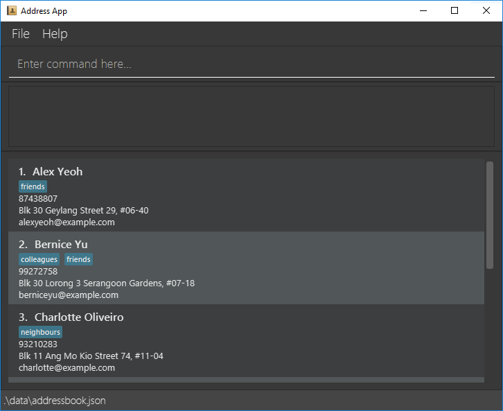
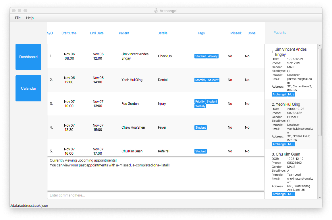
- New Feature: Overall UI and Tabs
- What it does: Cleaner and more user-friendly UI, which separated Archangel from the original AddressBook. I also replaced all the wrapper to anchorpane which is a more responsive design and implemented tabs for the dashboard and calendar.
- Justification: The change in UI helped us implement other features like Calendar and ensured that you have the patient list at all times. This allows a better user work flow, seamlessly integrating Patients with Appointments.
- Highlights: The application became more intuitive and suited for our clinical data management app.
-
Credits: The idea to organise the ui in tabs came from KeepToo Youtube Channel
Before:

After:

-
Code contributed: RepoSense link
- Project management:
- In charge of Filters, Testing and UI
- Ensured features being implemented are sound and intuitive
- Managed code quality
- Enhancements to existing features:
- Documentation:
- Community:
- Reported bugs and suggestions for other during PE-Dry Run
- Helped my teammates with major logic bugs like scheduling appointments
- Performed timely checks of the current project for any logic or documentation errors